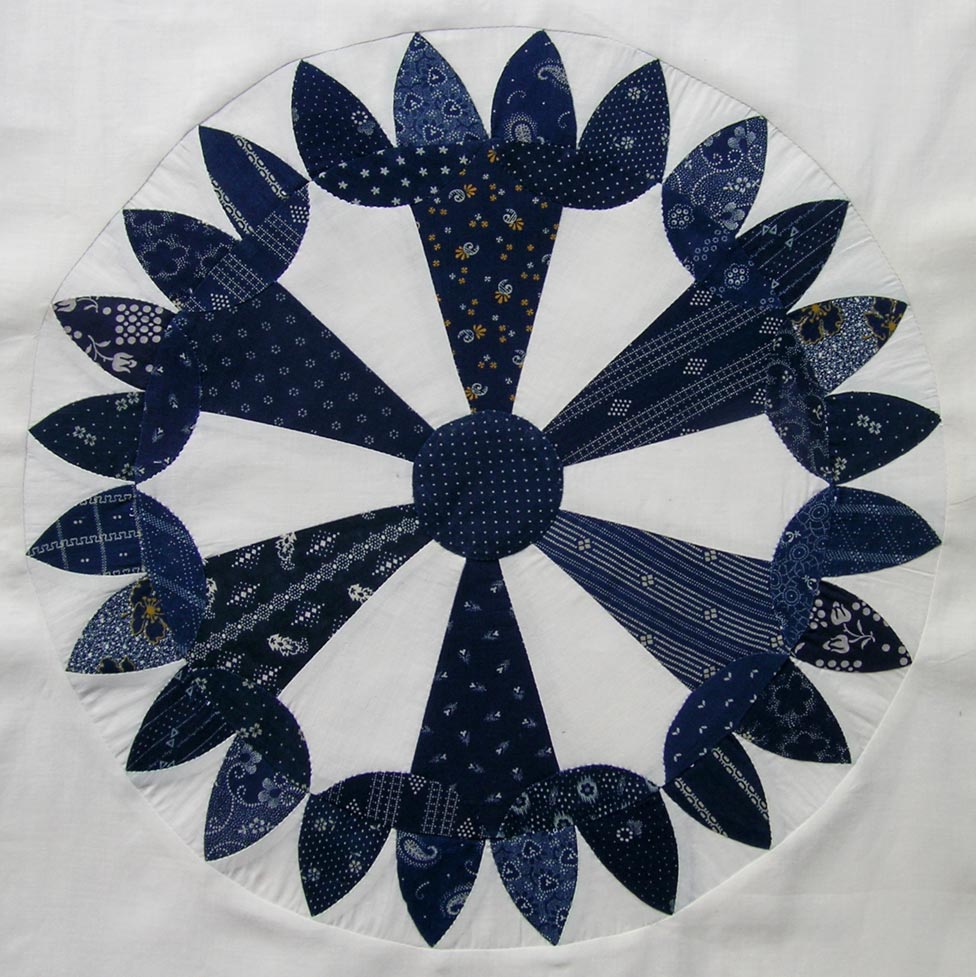
This is the third block in the Ann Champion Series, and it was the most time-consuming so far. The large interior pieces can be machine stitched, but all of the smaller curved pieces must be hand stitched. The center circle is appliqued and the muslin outer piece is machine sewn.


The outer edge of small curved pieces was tricky — you can probably tell in my block below that I had to ease the curved muslin pieces into the outer circle. I think it won’t be as noticeable once the top is quilted.
Although I intentionally changed the color of the center circle, it would be a complete lie if I said I made a decision to change the color of those lozenge shaped pieces — I just wasn’t paying attention and didn’t notice until I was probably halfway done with the block. I’m always making stupid mistakes like that, but right now I’m not planning on changing this one, even though I think I like the coloring better in the original pattern. Of course, I may change my mind later and make a new one.

Just for fun, I Photoshopped my block picture to look sort of like the original. I’m not sure now — which version do you like best?

So hard to say which I like better, but they are very different. The first one with more blue has a more serious and sedate feeling about it, while the photoshopped version with the white is more whimsical.
I can see tulips around the border of the blue lozenge block or perhaps fortune cookies (but I’m kinda hungry right now :)). It would be a fun block to play around with color a bit. I like the airy feel of the Photoshopped block. Once again, you have done a great job drafting the pattern and making a sample block!
Hmm.. it’s hard to say which I like best. I do like both of them very much. From a design perspective, I enjoy the extra negative space of the second one. But the first one looks like flowers blooming from the centre, which appeals to my cloud-watching imagination. :o)
I like the second block the best.
I can’t believe you pieced this. Amazing. I don’t know which one I like better – they’re both very different, and I like them both! Lot of help I am.
I have gone back and forth, as well, but I think the original colors are slightly ahead. Tomorrow, I may reverse myself. I am loving your blue fabrics!
Thanks everyone for your input. After looking at both of the Pyrotechnics block photos with the other two indigo blocks, the first one looks a little heavy. I decided tonight to replace the indigo pieces with muslin.
I like the second one best – I like airy quilts. The first version might be cute in ‘tulip’ colours.
Did you applique the centre circle?
Thank you! I simply adore those old curved patterns! Beautiful!
Beautiful block, Martha. Loving these blues you are using 🙂
Oh Martha!!! I love them both! They look like two different blocks and are a great example of how color placement can change a block.
The block looks like a stinker to piece and you did a wonderful job on it.
Your drafting is really wonderful too.!
🙂
Love the 2nd version. I’ve got to make these blocks!
I like the one with more white better, I think it shows off the parts better. Of course, it might just be that the second one looks more like a flower and that’s why I like it… : )
I just found a quilt in an antique store in Oklahoma that I think is this block with sashing. Did you ever finish yours ? I am now the proud owner of this quilt and it was probably done in the early 1900s I am thinking.