This is my entry for Amy’s wonderful Blogger’s Quilt Festival. It’s the first quilt I posted about when I started my blog. Nobody actually read my blog back then, so I thought I would bring this little quilt back into the spotlight because I loved making it.
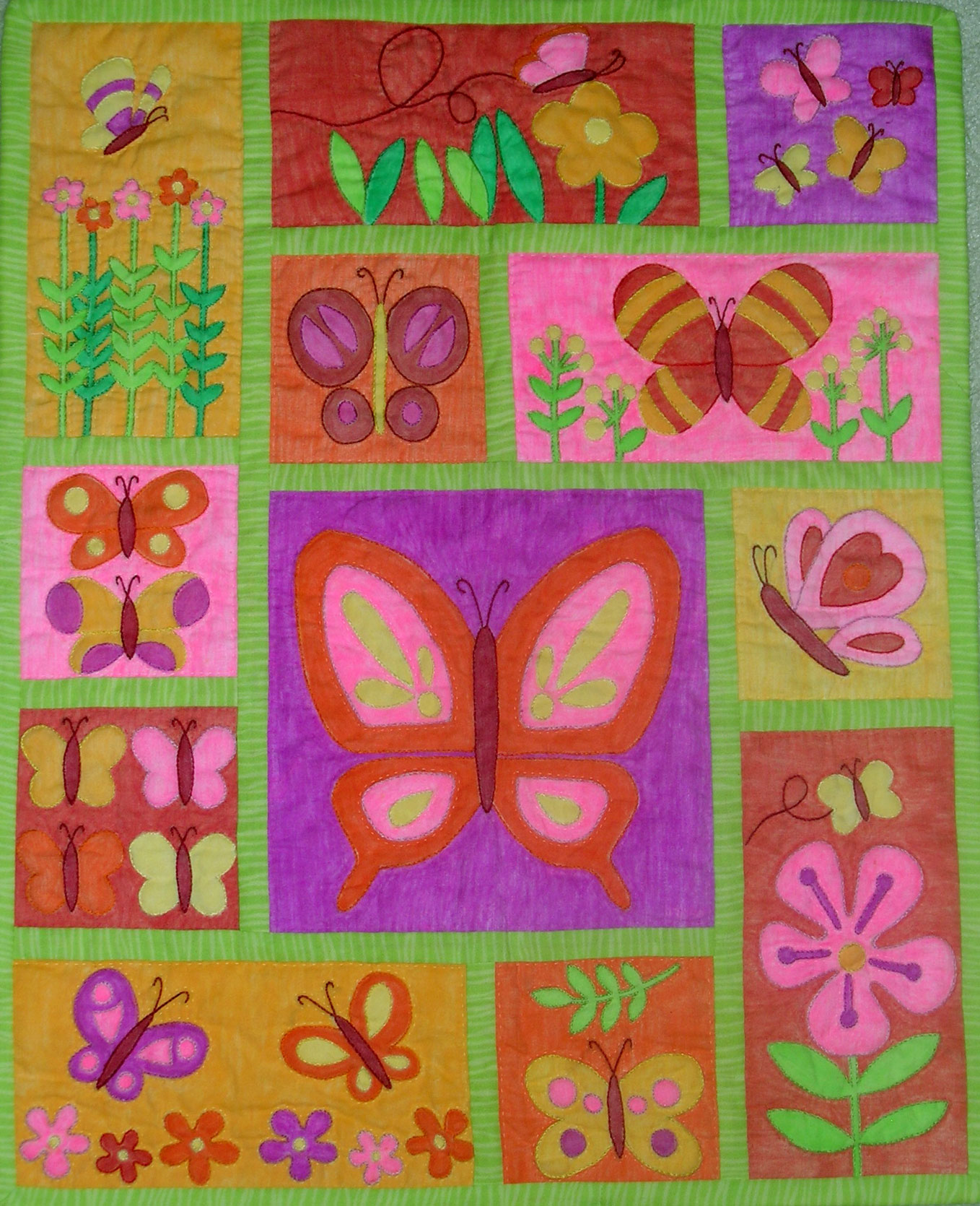
A Quilt for Julie
Martha Dellasega Gray, 2008
crayoned, hand embroidered, hand quilted
18″ x 24″

This was part of my auction donation for our school — along with an American Girl doll (Julie), a trunk and lots of 70s style outfits that were fun to sew. I selected the block designs from a full-sized applique quilt pattern published in a 1970s book, but my quilt is crayoned and outline embroidered instead of appliqued, and I changed the colors a bit. The hand quilting is done in colored thread in a simple outline around each motif and block. All the colors on the blocks are crayoned, including the background — it was fine for this size, but probably not something you’d want to do on a big quilt.
TIP: To achieve the saturated look with the coloring — after tracing or transferring the design, apply freezer paper to the back of your fabric square. This keeps the fabric smooth and allows you to apply a heavier layer of crayon. Use firm, consistent pressure on the crayon, and try to go in the same direction whenever possible. Although adding another layer of crayon after the first pressing will result in a more saturated look, I have found that the piece becomes rather stiff and has a unpleasant feel to it, so I just use one application.
I think the quilt was perfect for Julie, and hopefully for the little girl who won it as well.


Fantastic! I’ve done crayon/embroidery but I didn’t crayon the background too! This is just wonderful!
You’re right – I hadn’t seen this one before, it’s wonderful! I love crayoned quilts and this is a beauty. I had to take a second look, because at first it looks appliqued. How did you get the colors so intense? I can never get them like that, they always come out so pale. This is beautiful, Martha!
Fascinating technique. It really looks good even making the photo larger to see it more closely!
That is AWESOME! Just perfect for Julie (who my oldest wanted SO badly)! The colors are so vibrant, not an easy feat in my experience with coloring fabric. The pattern is really cute. It must have been the talk of the event. We would have had moms and daughters HOVERING around it at our school’s silent auction!
I have read quite a bit about this quilt show today. I’d better boogie on over and check it out!
I remember this quilt! You really did capture the ’70’s colors and aesthetic! I think your post was the first time I had heard of coloring fabric. It is really a very pretty quilt for a little hippie doll!
A delightful butterfly quilt.
Martha, it’s lovely, just sings spring! How did you ever get the colors so bold????
Beautiful quilt, I am glad you brought it back so we can all see it. Thanks
This quilt looks great. No problem with reposting at least by me. One blog I read id this every week – “Flashback Friday!”
Love the butterflies. Very pretty layout. First time I’ve seen coloring used all over.
Your quilt is beautiful! What a great donation for the school. Very generous.
pour un premier quilt il est très réussi ,les couleurs sont rayonnantes et le design original félicitations
This is beautiful! That is a great idea for using crayons on fabric. Thanks for the tips.
BTW You always have such wonderful quilts to show here. One day I hope to make a quilt inspired by your Hello Kitty quilt.
It is a lovely quilt. Great design and colour.
This is just perfect for a little girl!!!
This is a beautiful quilt! I have actually already marked your Dresden plate quilt as a fave over in flickr. You do beautiful work!
lovely quilt and nice you donated this wonderful project. i would love to try your crayon ideas–have done batik before with melted crayons but not this. thanks for sharing