When I started this project, I had a few rules:
Each block would use one color of variegated floss.
Each letter would have a pattern design — same pattern on each letter.
The letter designs would stay inside the letters.
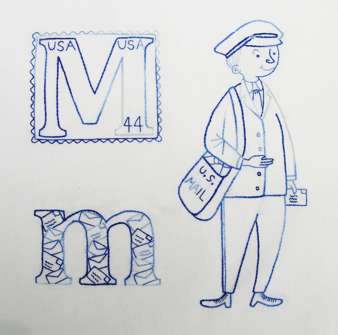
The first rule has been broken twice, and now with this block I’m breaking the last two. You might ask…”Why didn’t you just use the little envelopes in both letters?” I don’t know — I just really liked the stamp, but it didn’t look right on the lower case m. Oh well….even though it’s very different from my other blocks, I still like it. Also, I am so relieved to have finally come up with something — anything — for these letters. I can get pretty stressed out about something stupid like this.


I love the m’s!!! The stamp and the envelopes are perfect!
M is for MARVELOUS!!!
It just goes to show that there is an exception to every rule! I REALLY like both the upper and lower case M’s. It is funny to think that years from now, someone will look at the stamp and say, “Only 44 cents!” They are perfect! Ann
I think they look great! A perfect compromise (that’s what I call ‘breaking rules’!)
My favorite so far!
Fantastic letters! This is my favourite block yet!
I’m looking through your ABC posts here. Love what I see, though haven’t found the wool squares as yet. I’m still working my way through the list. Love the letters/mail in the small m. So clever! I’m a retired elementary teacher and one of my other passions is alphabet books. I have a nice collection and they are the one thing I kept when I left teaching. ~ Sarah