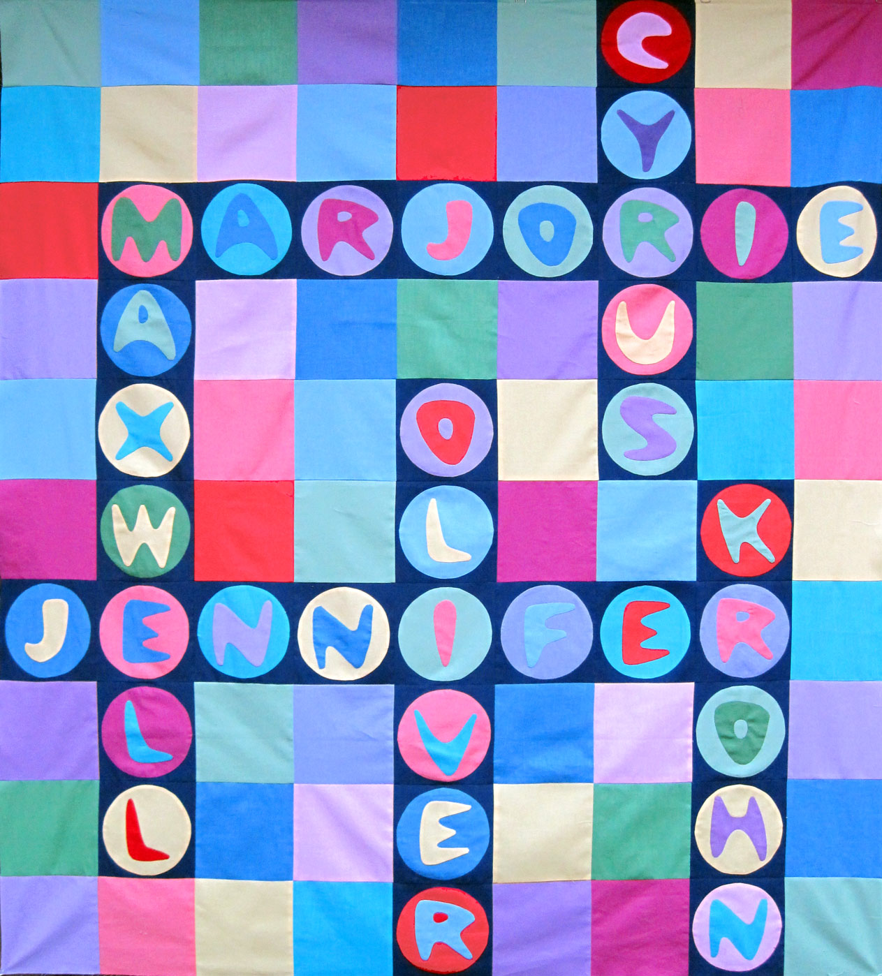
If you compare this top to my original plan, you’ll notice that I didn’t pay any attention to the colors of the background squares. I have my doubts about the introduction of the bright red. It looks okay in the letter blocks, but I’m not sure I like it in the background squares. Since I’m…